
Arise
Objective: Arise has been on the cutting-edge of gig work for three decades, but they had an out-dated and limited brand that needed updating and expansion.
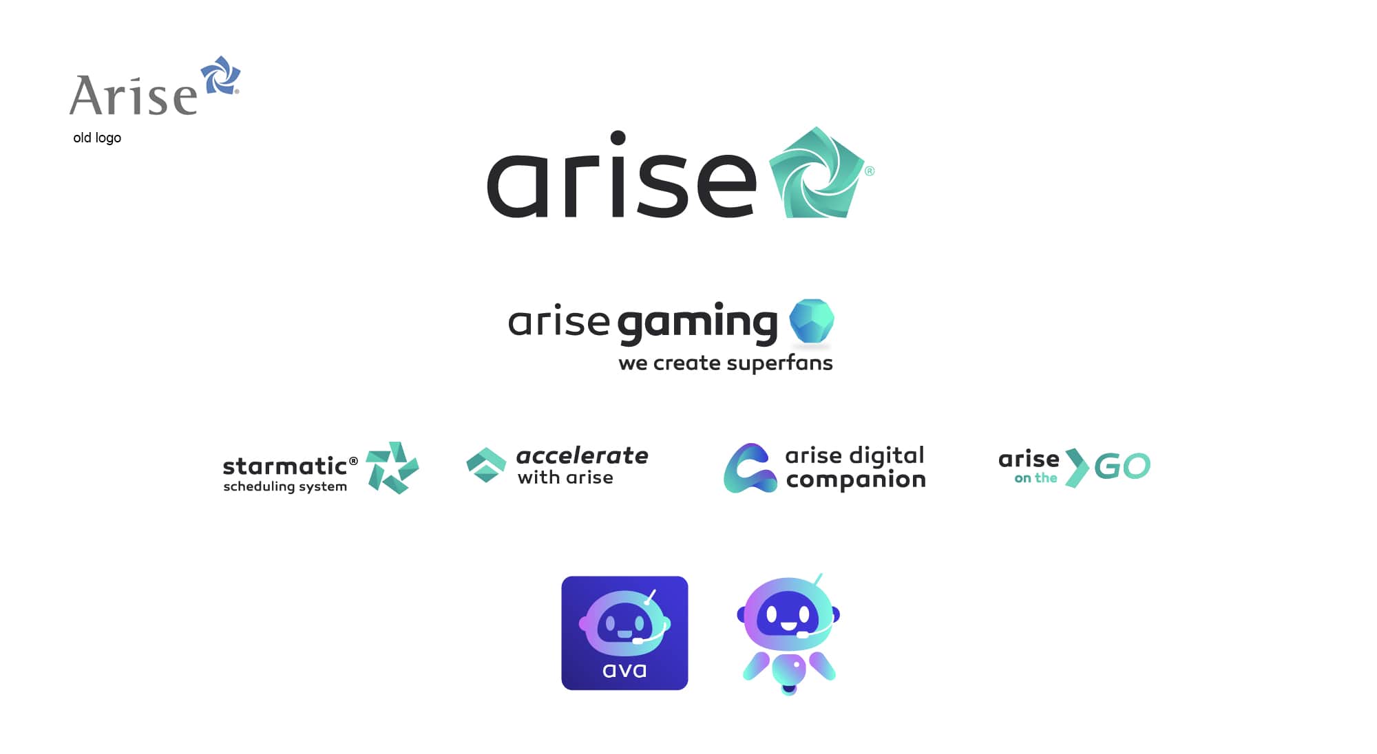
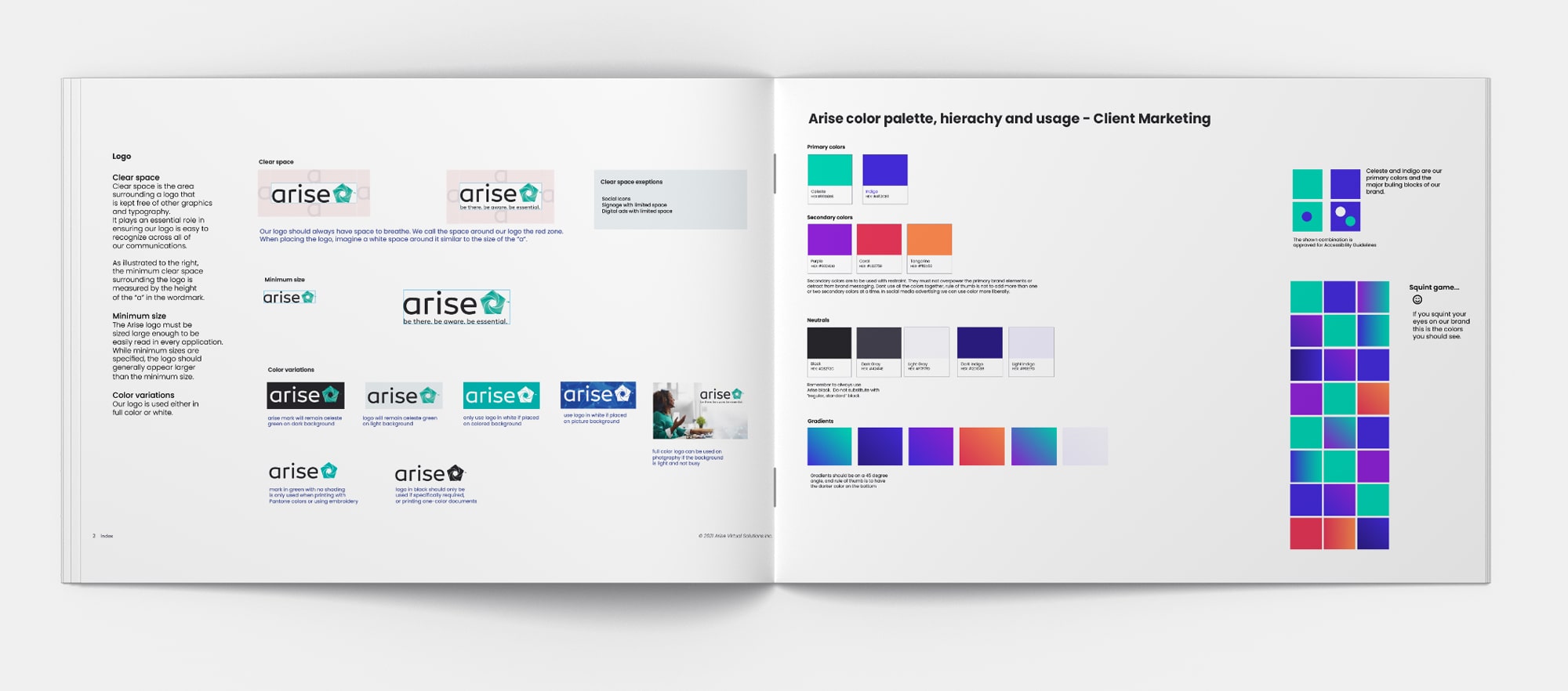
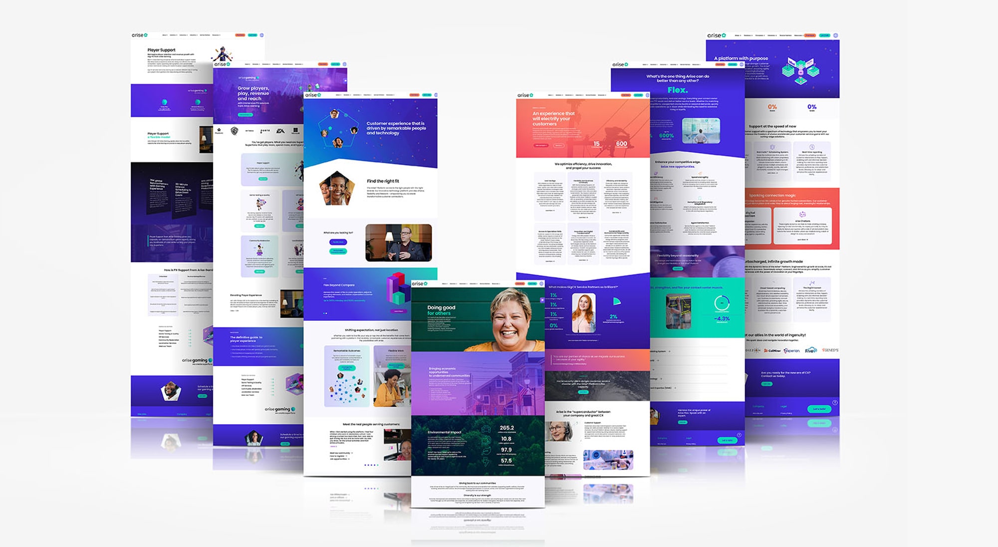
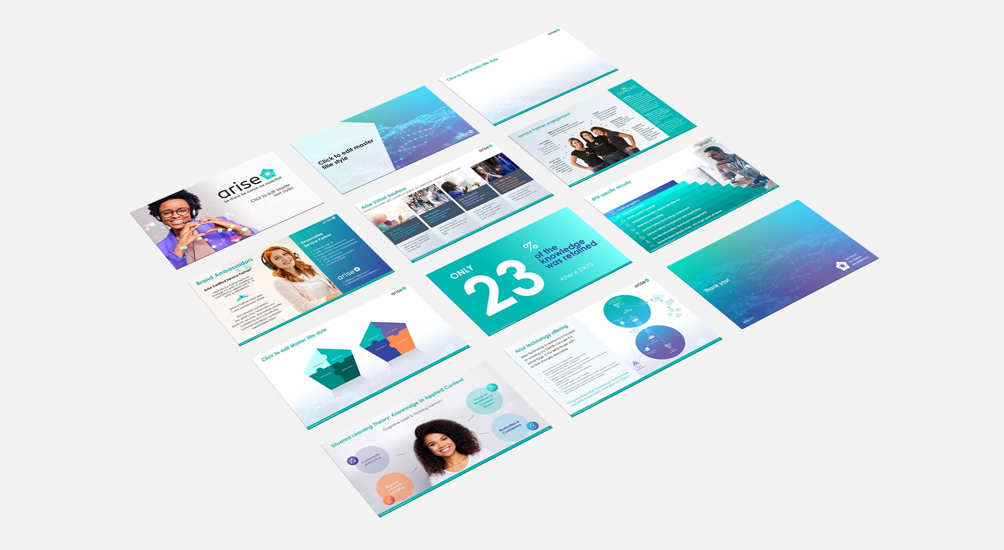
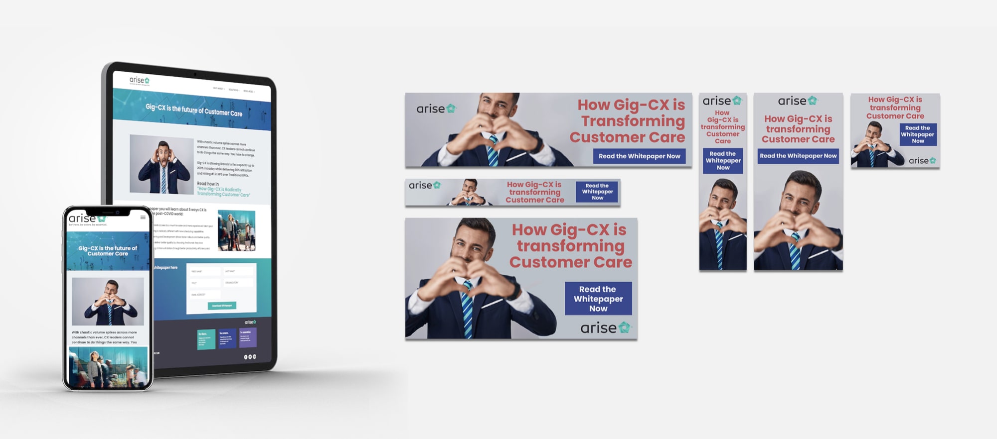
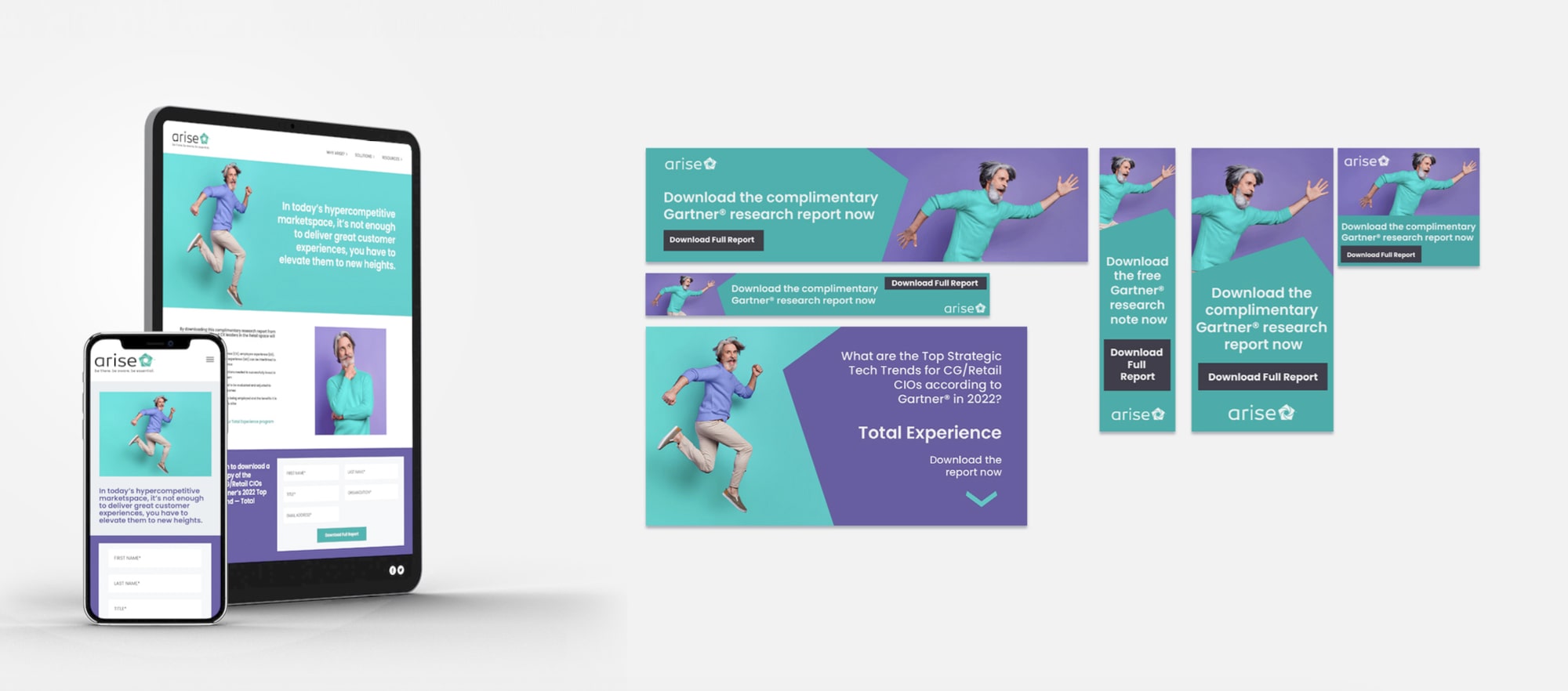
Process: The rebrand had to reflect their innovative technology as well as represent their huge community of 80.000 work-from-home customer service agents. Their original logo was nick-named the pinwheel, and I used its shape to evolve it into a “home”, symbolizing their services. In addition to the logo, a fully evolved brand was created.
Result: The new facelift has helped propel the company’s massive growth in the last two years, and strengthened the companies perception both online and at in-person events and tradeshows.
Category:
Date:
December 30, 2023